study case for Bsport
March 2023
BtoC e-commerce
Recruitment process (passed)
Test goal
The purpose of this test is to evaluate my ability to analyze a digital platform and assess its user experience, with a specific focus on usability, clarity, and perceived quality.
Test procedure
The test consisted in reviewing an appointment booking calendar and sharing structured feedback based on my user experience. The scope was limited to booking an appointment and did not require creating a customer account. Based on this analysis, I was then asked to propose an improved version of the calendar through a wireframe.
User story
Boutiques are a growing phenomenon in the wellness and sports industry. Beyond organizing classes, these studios offer a premium environment, including additional services such as massages and product sales.
As a novice yoga practitioner, I wanted to book my first private massage session as an entry point into this boutique experience. With limited knowledge of the offering, I was looking for a simple, reassuring, and intuitive way to access essential information such as schedules, service descriptions, and availability.
Like many boutique customers, I expected both a premium experience and a seamless booking process.
Test conditions
The test took place on the following booking calendar: booking calendar link
The analysis was limited to this page only and did not include the rest of the website.
Test scenario
- Goal: book a 30-minute reflexology session in the afternoon
- Login credentials provided for the test
- Process stopped at the payment step
User feedback
Calendar experience
- Overall perception of the calendar layout and visual design
- Ease of access to key information (schedule, service details)
- Clarity and intuitiveness for a first-time user
- Perceived level of premium experience
Booking funnel
- Overall look and feel of the booking tool
- Clarity of information throughout the process
- Simplicity and intuitiveness for a new user
- Consistency of the premium experience
Global feedback
- Overall assessment of the user experience given the user story
- Key strengths of the booking experience
- Main pain points and areas for improvement
Wireframe proposal
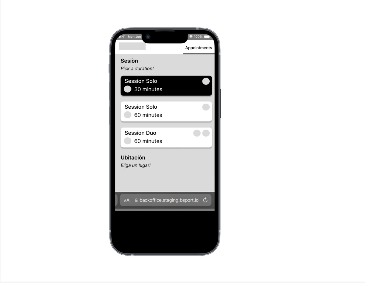
Based on the feedback collected during the analysis, I designed a wireframe focused on improving the clarity, hierarchy, and usability of the booking calendar.
The scope of the wireframe was intentionally limited to the calendar interface itself, including:
- Service duration selection
- Teacher selection
- Available time slots
The goal was not to deliver a final UI but a clear UX structure illustrating how information and actions could be better organized to support a premium yet intuitive experience.
Tools & format
The wireframe was created using the tool and format of my choice, with the only constraint being that it could easily be shared by email.
Duration
The test was completed within the two-day timeframe provided after receiving the test instructions.